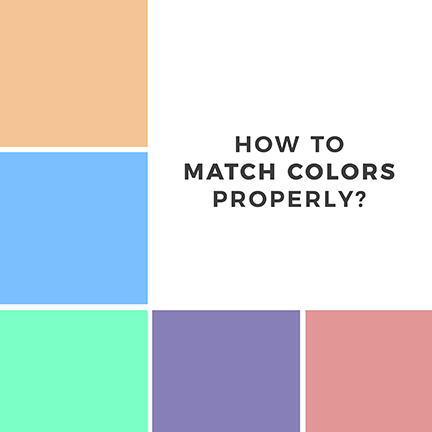
Choosing color combinations is one of the hardest decisions for everyone when it comes to achieving pleasant colors for aesthetic purposes. Either designer or non-designer, it is a daily dose to find out some colors that can be matched with a particular color, whether in a form of clothing, solid material, or a huge scale element like walls.

As a designer, it is easy to find a color match, but in a long run, it is a hard decision to make. In my own experience, I really do some research and palette matching in Photoshop. Anyways, here are the TOP 5 tips on how to match colors properly.

1.) Always consider the contrasting colors on the Color Wheel.
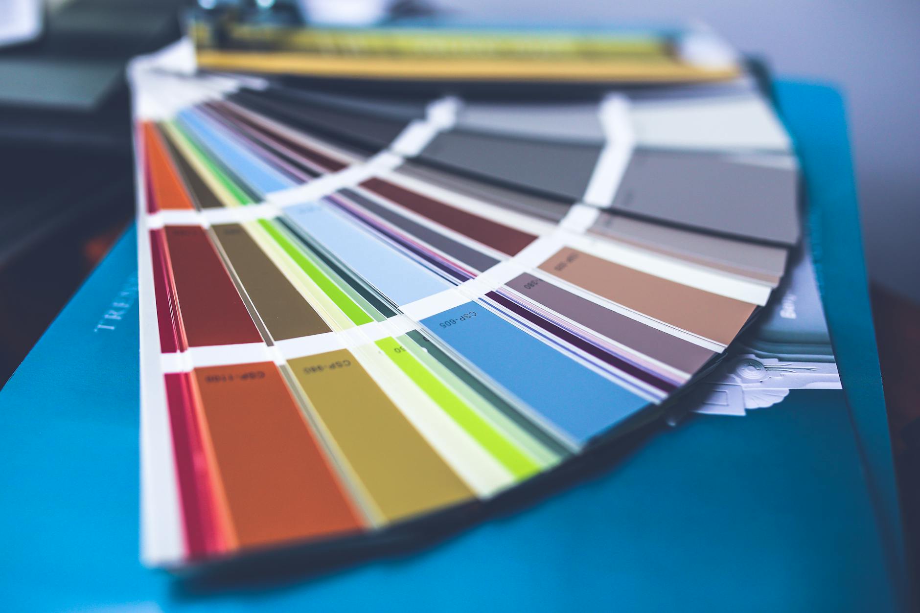
Are you familiar with color wheel? If not, it’s about time to learn about it. The color wheel or Color Calculator is a circular color chart which composed of schematic color patterns of warm colors to cool colors and so on. It is divided into 2 shades, the warm color shades, and the cool color shades.

Warm Color Shades: Yellow, Yellow Orange, Orange, Red Orange, Red, and Red Violet.
Cool Colors: Violet, Blue Violet, Blue, Blue Green, Green and Yellow Green.
So what Contrasting Colors mean?
The easiest way to figure out contrasting colors is to find its opposite color based on their placement. For example, the opposite color of red in the color wheel is green. And by the way, the contrasting colors of red and green are famous when we talk about Christmas. 
I made a color calculator chart to explain how you would figure out the exact contrasting colors of each color scheme.

2.) Not Too Distracting In Eyes
The Hue, Saturation, and Lightness have a big role in achieving good colors. It is similar to cooking, which it serves as flavorings like spices and seasonings. When the flavor is over, it can cause something bad as a result. Oversaturated colors are not so pleasant in eyes because it is necessary to put oversaturated colors in a design.
Instead, you have to adjust the Hue for color scheming, Saturation for color volume, and lightness for a color value.

Low saturated colors can result in a muted or dead color. In lightness, the true value of a color can be found on its neutral volume about 0.
Always consider the colors through your vision.
3.) Try Analogous Colors as Secondary Color
Back to the Color Wheel, Analogue or Analogous Colors are groups of colors that are next to each other in the color wheel. Analogous colors are group into 3 schematic shades of color with one dominant color which tends to be a primary, secondary, and tertiary colors.

The best example is the analogous colors of Red, Red Orange, and Orange.

4.) Make Neutral/Muted Colors
Mostly the colors in branding are not 100% saturated or in a true value.

Based on what I observed, Neutrals and muted colors are mostly dominant in top brands for clothing, furniture, and industrial field.

Neutral colors can add an elegant and sophisticated effect, especially for brands because it is unusual to use true value colors for brands, except for brands who market the youth like kids and toddlers.
5.) Try Achieving Minimalist Colors
Always consider choosing at least 3 colors for design or brand. The consistency of matched colors for every design is a must to implement a better standard when it comes to colors. 
Providing a certain amount of colors is the easiest way to achieve a minimalist look for a color palette.

Bonus Tips
I really like to experiment color palettes on my own. Well, I am excited to share with you my personal color palette presets that I usually used for my illustrations and daily design sessions. So here are my 10 personal color palettes.
My Best of 10 Color Matches/Palette
1.) Happy 90s
2.) Clean & Informative
3.) Marine Scientist
4.) Fashion Blogger
5.) Pop Candys
6.) Mr. Charlie Brown
7.) Moody Dude
8.) Youth
9.) Rainforest
10.) Minimalist Artist

I hope you can relate to this blog post and I am happy if you have thoughts or comments about this topic. You can drop your info and thoughts below. Let’s discuss and share thoughts for a while. Thanks a lot for reading this blog.
Stock images courtesy by Pexels.
Leave a Reply